Cody Rhodes
WWE Elite Collection Series 13
Mattel/ 7" Scale
$19.79 (Target)
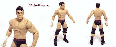
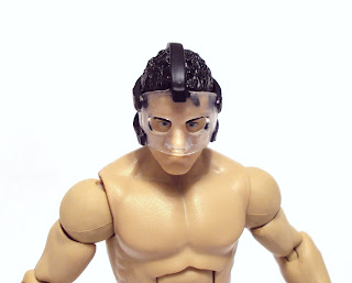
If you own the previous Elite Rhodes figure (from way back in wave 3), then you know what to expect from the current release, but with the addition of a new head sculpt and knee pads. I think the face captures his likeness well, a bit soft and not as good as the E3 figure's, but I suspect it suffered a bit to make the removable mask work. Mattel sure gets a lot of mileage out of this torso, though; CM Punk, Ted DiBiase Jr., Daniel Bryan and a handful of Legends, too! I hate to be nitpicky, but I will, and I have to cry "foul" here.
Over the course of 150+ Elite & Legends figures I've learned that inspite of Mattel's digital scanning/sculpting process, they still refer to reusing parts. To their credit they've managed to create a vast parts library in a short amount of time considering some of their other "adult collector" lines like Masters of the Universe Classics and DC Universe, but they can't make 100% unique sculpts for everyone. It seems Cody Rhodes suffers from being in that grey area where his body style is "in-between" what's available, something I think Randy Orton's figures also suffer from. With Cody it's not as much about the size as it is about muscle tone. I really feel Mattel could have used the high-definition torso seen on Orton to deliver a Rhodes much closer to the real-life Superstar. Some might say he isn't THAT toned, but everyone can agree that he IS more toned than the figure suggests. In this case, I don't think a little exaggeration is uncalled for, unlike with someone else.
Paint is very minimal on this figure, most of it going to the head for the hair and facial details. Cody's now-familiar taped-up right hand/wrist is done using solid white paint, which leaves a something to be desired in the way of authenticity, but we've come to accept at this point. The only other apps appear on his shorts which are molded in black plastic and feature a maroon waist band and "CR" logo over the right hip. Paintwise, everything was on the up 'n up on my copy.

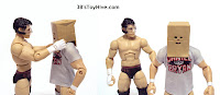
I was really excited about this figure when he was revealed with the great accessories, so much so that I didn't really care about the decos. After finally finding him at retail and getting him in-hand I was pleased with the accessories (even the jacket), but this deco is just a bit too plain for me. It's not bad or inaccurate, it's just not what I really wanted. This wasn't helped by the $19.79, pre-tax price tag he had at the Target I found him at. Although, that specific store always over-prices their stuff. Don't know why.
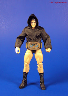
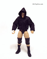
While this figure is full of creepy-fun potential, my definitive CR figure would feature the white shorts with his more-recent, inverted chevron logo in black and sport the smaller, white knee pads. Also, it would bring his white hooded vest and Classic Intercontinental Championship belt, with a white strap of course! I don't want to discredit this figure, though, because I feel he looks good and looks even better without knee pads and carrying the IC title! I'll accept the fact that it is highly unlikely Mattel will use a different body for future Rhodes figures at this point, so this is still an acceptable version I'm happy to have in my collection.
Will Mattel ever make the white/black version or skip it in favor of the current maroon/white outfit? Time (or SDCC) will tell. For now, I guess that leaves us at a cross-Rhodes.
; )